Jostle Blog
A modern home for Jostle’s primary marketing channel.
The problem
Over the years, The Jostle Blog jumped from CMS to CMS to improve our marketing efforts. In the process, the user experience was getting kicked around. We kept migrating the site without investing time and energy into understanding how to execute design on our latest and greatest platform.
Hundreds of articles were published into inelegant layouts. Our writers wanted an beautiful home for their words but no one had bandwidth to make things better. Our readers suffered with some janky experience and our engagement numbers showed interest and we should improve.
The solution
January 2018, we decided to do something to fix the problem. We set these goals to define our vision and set the scope of the project:
- “Unbox” our content to better showcase our work.
- Make it easier for our readers to respond to articles.
- Remove clutter and distractions to improve reading.
- Give the opportunity to read more from our resources, popular articles, and other content.
- Improve subscribing for updates.
- Direct people to jostle.me—home base for product marketing.
- Easier publishing workflow when adding content.
- Increase visual consistency with other branded assets.
- Improve engagement numbers
Design process
I followed a fairly predictable design process for the project. Starting with explorations in my sketchbook and in Figma. Taking those ideas through concept and design reviews with the broader team. Then building up a staging site in HubSpot for futher review—live on the web.
Snapshots of the design process
Navigation
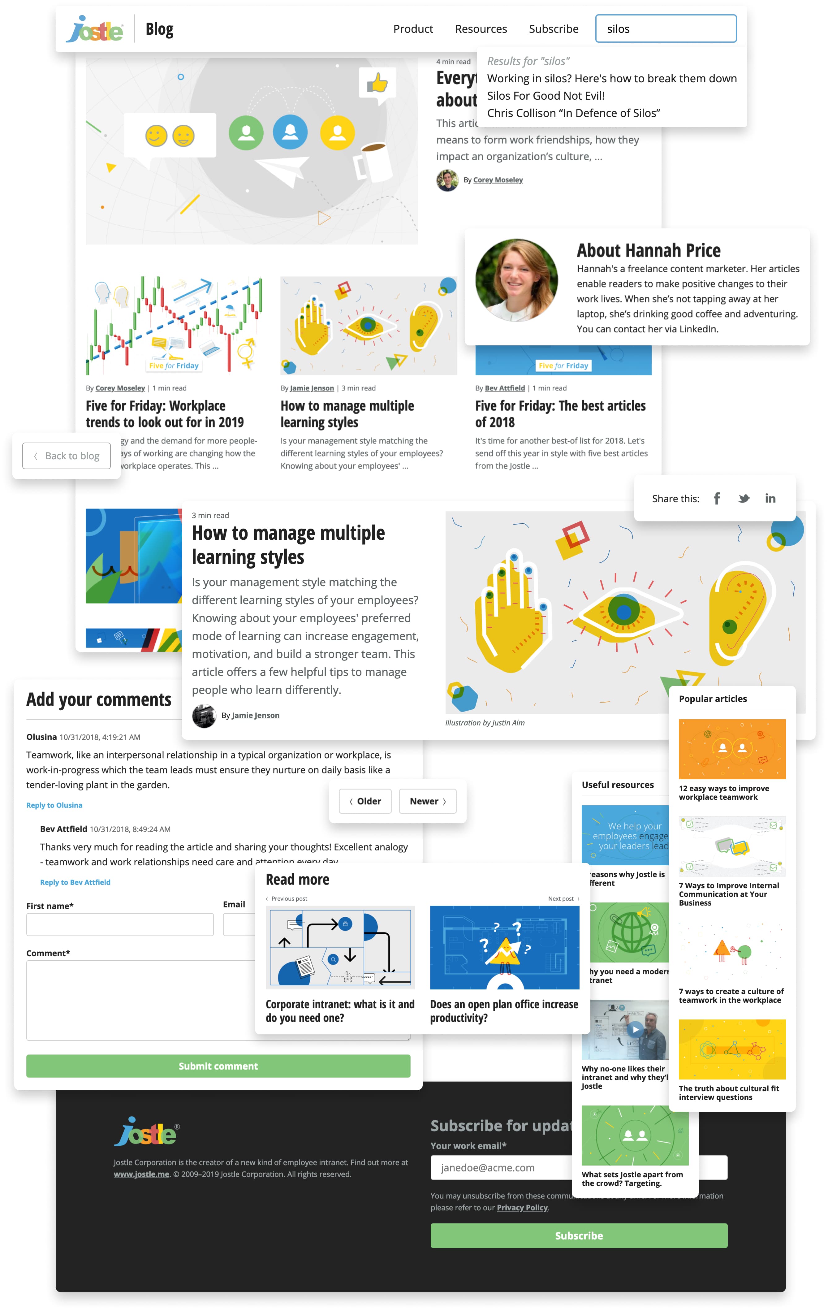
We removed the large masthead. We added a unique “Blog” link beside the Jostle logo to provide context for visitors. This also gave us the ability to keep the Jostle logo as a link to jostle.me and also provide a link to the blog home base. In an effort to connect blog visitors to jostle.me, we added links to our Product and Resources pages. The CTA to “Subscribe” had similar proportions to the search input so we repositioned it as a link in the nav. We then widened the search input and moved it to the right.


Listing pages
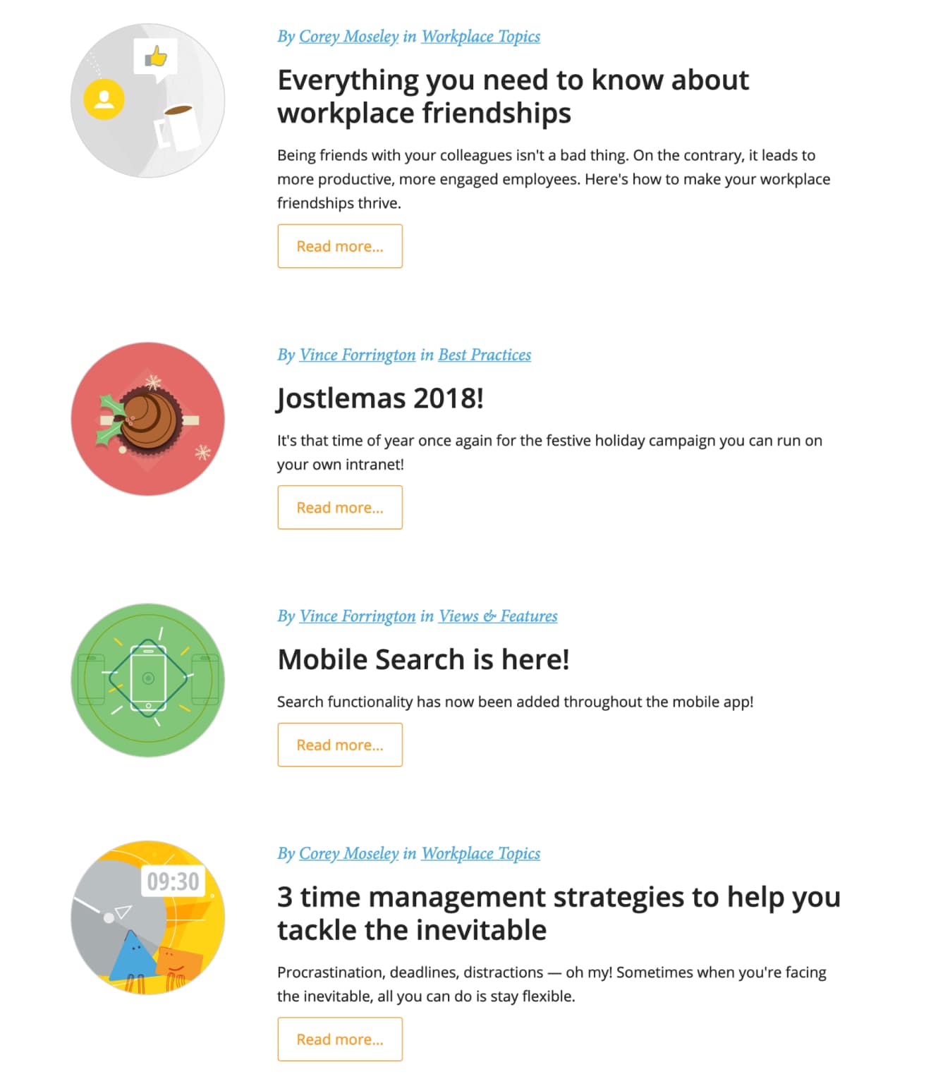
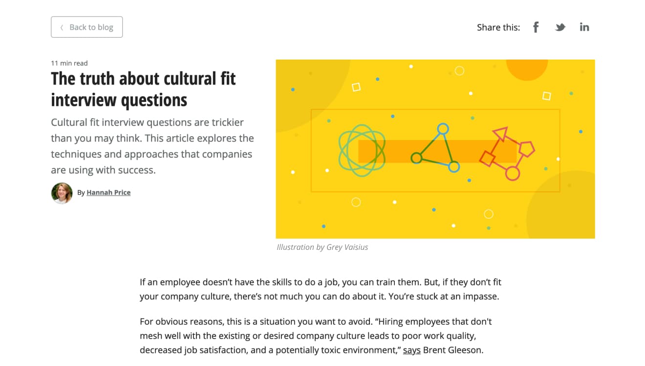
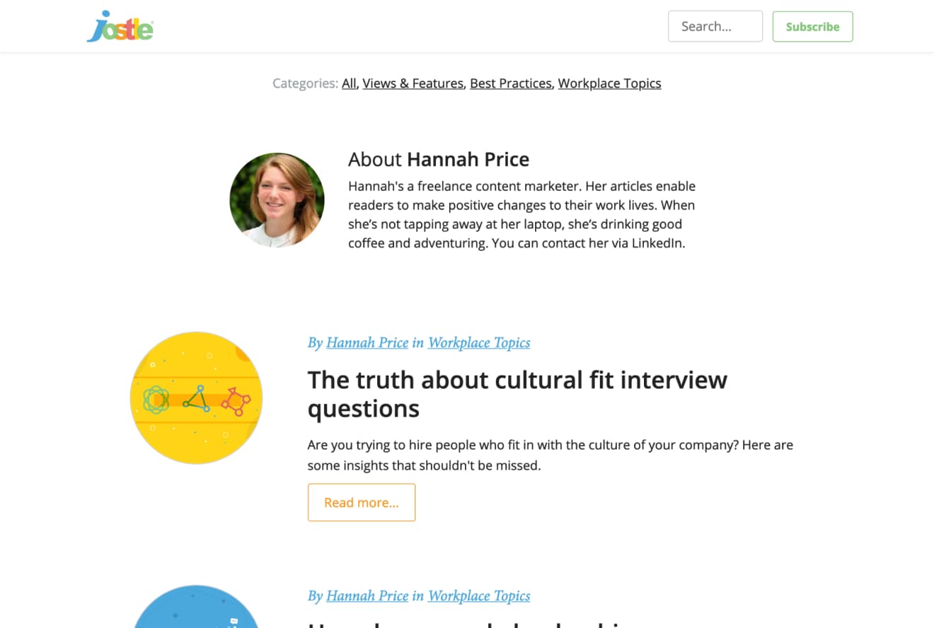
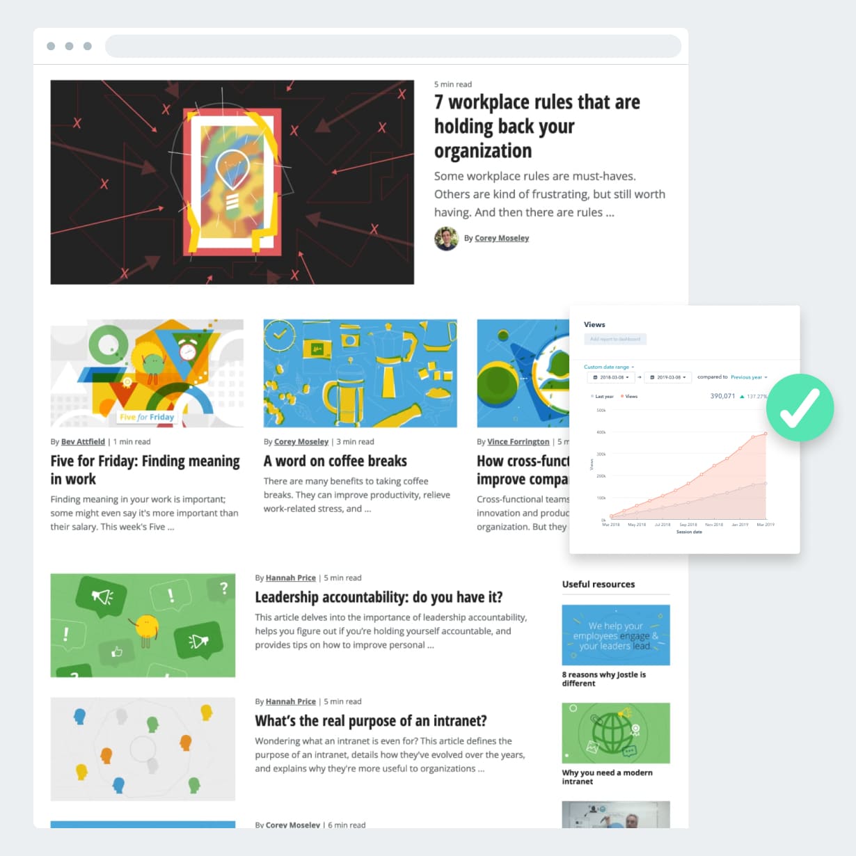
For the listings pages, we changed the design to use our 16x9 featured images, which are used in the header of the article. This way, we no longer needed a secondary, small, square asset. Less to prep, maintain, and mess up in the future. Also, the full glory of our illustrations get exposed for the world to enjoy!
We added some variation to the listings pages to make them more engaging. Varying the size of each listing enabled us to highlight recent articles, then direct attention futher down the list, and surface useful resources and popular articles on the right—content outside the chronology of the feed.
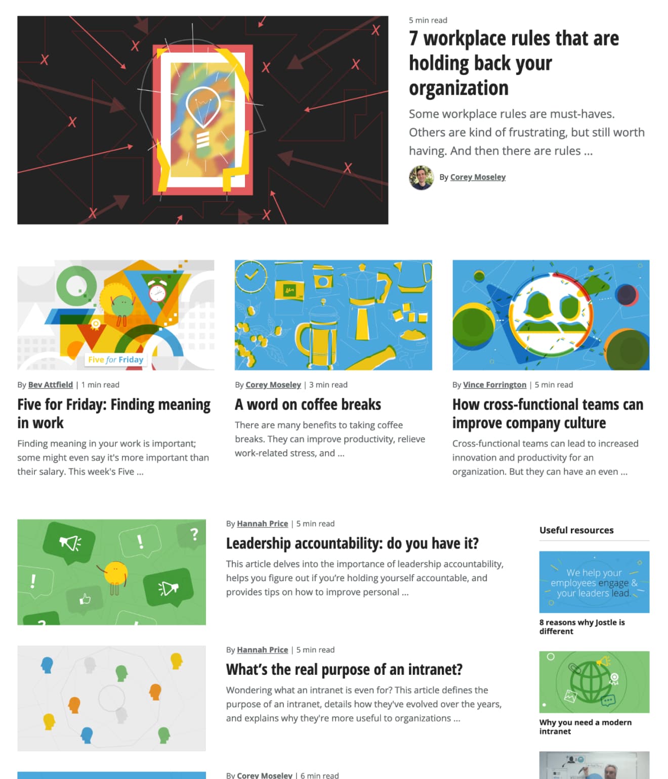
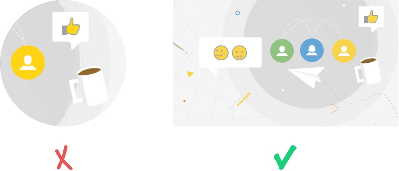
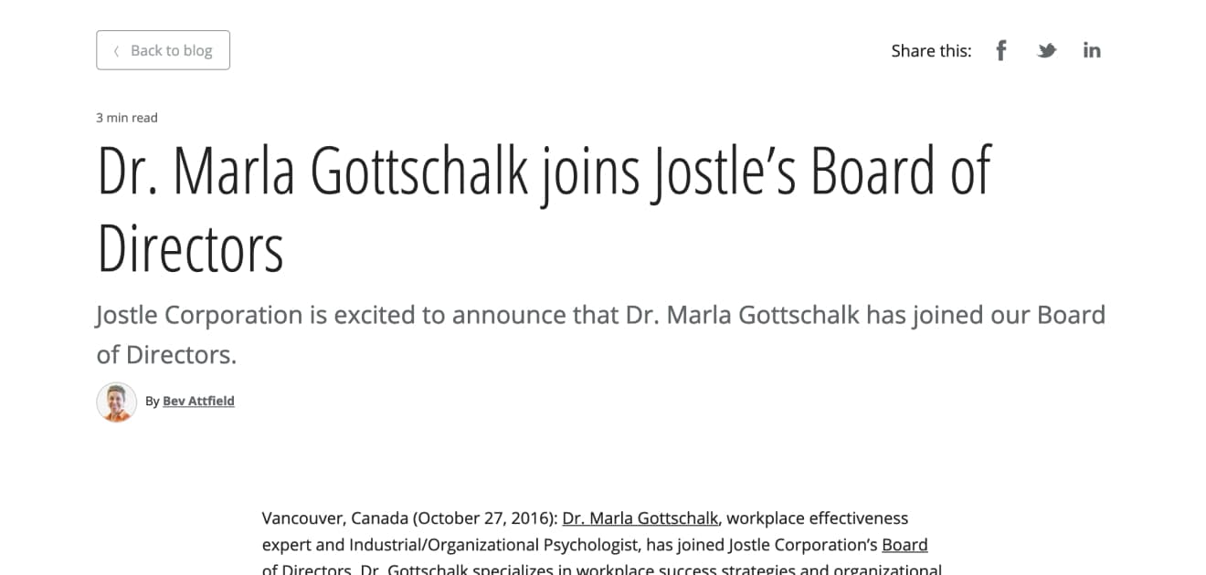
We also designed a variant for articles without featured images, which features big title type. This gives articles without images equal presence to articles with images.
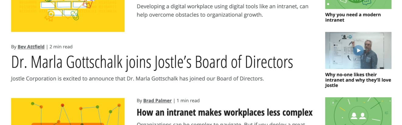
We also changed the pagination so you can only page between 10 posts at a time. We used to offer an “All” button as part of the pagination but when clicked, your browser would crash, loading 450+ article summaries and images at once. Needless to say, this is why we offer search in the header nav.
Jostle uses Open Sans across all of our product and marketing assets. We added Open Sans Condensed to the blog because it provides a few more characters per line, better wrapping, and improved contrast for titles against the excerpts. After the success of implementing this first on JostleTV, then the blog, we’re now considering using the condensed style across our platform.
Articles
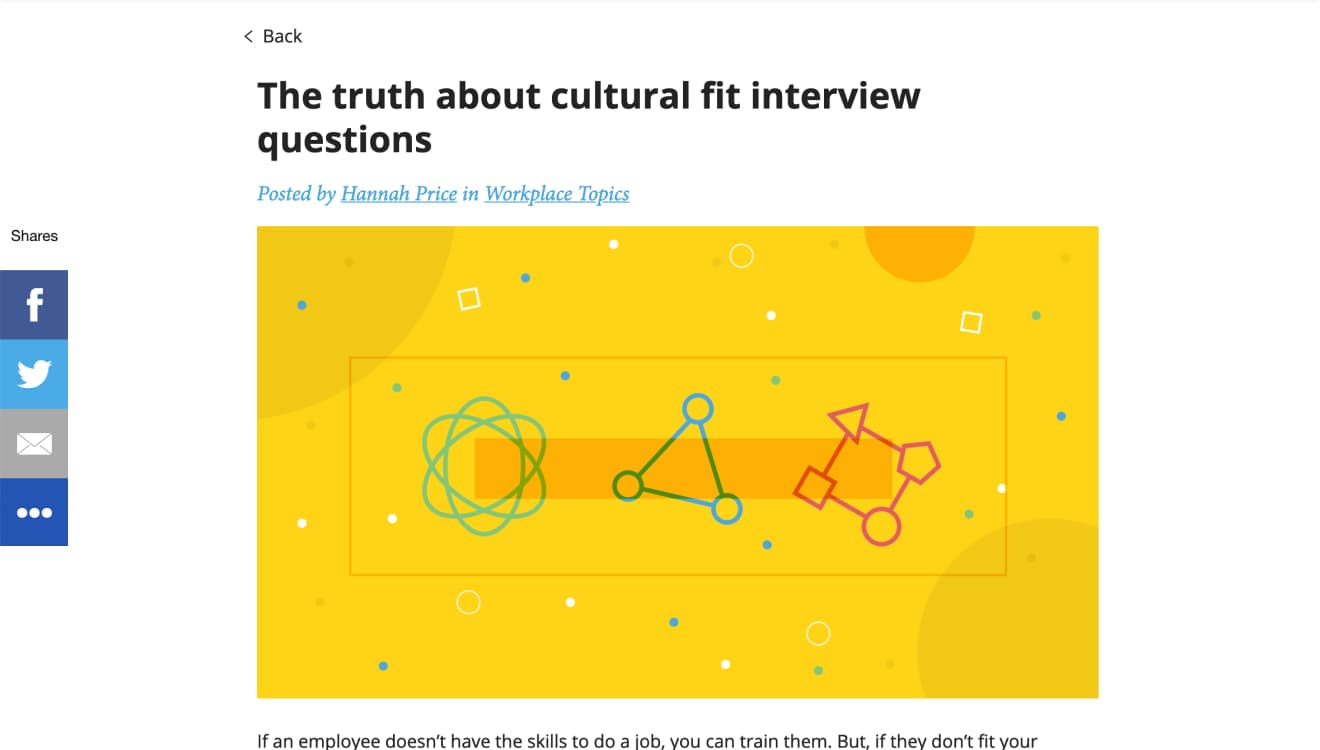
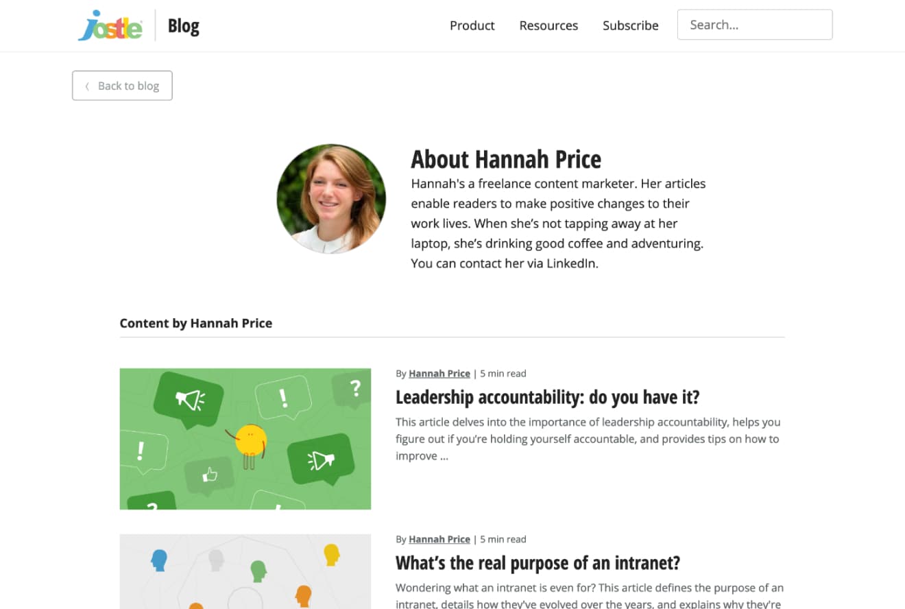
We added a “Back to blog” button to the top-left corner so people always have a clear path back to the listings page. I split the top fold of article so you see the title, summary, metadata, and image above the fold. I improved the styling of the author credit at the top of the article so it’s consistent with the styling at the bottom of the article. I also generally improved the sizing, colours, and spacing of the author credit so it adheres to our style guide.
We removed the Sumo share buttons that floated on the left-hand side of the page, which didn’t get clicked, exposed low engagement numbers, and were a distraction while reading. We still needed to offer a way for people to share on social media so we added social buttons top-right and bottom-right of the article. I gave the social buttons a more subtle treatment so they didn’t compete with our brand, illustrations, or content. I also improved the interaction of these buttons, making sharing a little more novel.
We added an “Image Credit” so the artist gets props!
We added an alternate layout for articles without a featured image.
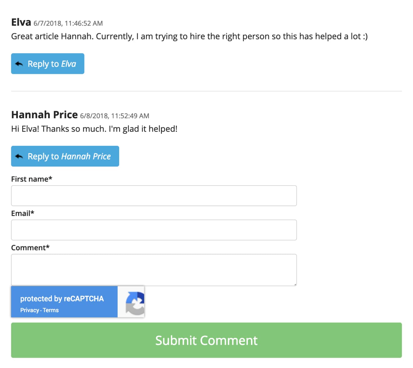
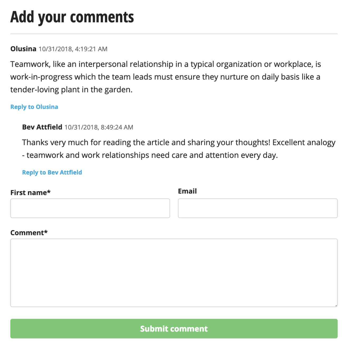
The comments section was completely restyled, improving hierarchy, font-sizing, spacing, colour, threading—all in adherence to our style guide.
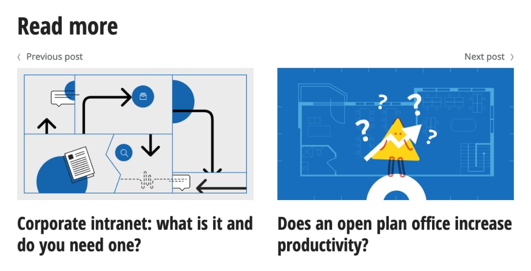
At the bottom of each article, we added “Read more” pagination with links to the previous and next articles in the blog timeline. This offers the reader more content to discover; encouraging a continuation of the journey.
Author listing
On the author listings, we improved the sizing and spacing of the avatar, title, and bio. On the previous version, the author’s avatar and bio too closely resembled one of the blog posts in the list.
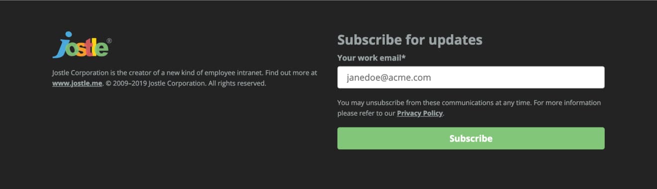
Footer
We styled the footer to be more consistent with our main marketing site, shortening copyright and trademark notices. We also moved the subscription form into the footer, which used to appear at the bottom of each article. Now it’s at the bottom of every page. When you click on “Subscribe” in the header nav, you are scrolled down to the form in the footer, which is then highlighted with a subtle marquee CSS animation.
An easier publishing workflow
All of these design changes also improved the publishing workflow. There used to be several required fields to make the old templates work but now the author only has to enter in the meta description and add an optional featured image.
Highlights from what I just shared
Reflection
I believe this project was successful because we had a clear definition for the the scope and vision for the project. This enabled us to move faster, make more impactful decisions during the design process, and eased the process of gaining alignment across our teams. We accomplished what we set out to do in less than 2 months and saw our metrics improve.
- Unboxed content
- Made it easier for our readers to respond
- Removed clutter and distractions
- Gave opportunity to read more
- Improved subscribing
- Directed people to jostle.me
- Made publishing workflow easier
- Increased visual consistency with other branded assets
- Improved our engagement numbers