Jostle Comment Actions
Improving the UX when taking action on comments in chat.
The problem
In Jostle, action menus on comments weren’t built to scale and customers were missing table-stake actions found in popular chat apps for the workplace. There was a sentiment across review sites that Jostle was “old-school”. We had a Jira backlog of feature requests for improving functionality in chat. Some of the most popular requests were:
- “I want to reply to a comment”
- “I want to edit my comment and see the history of edits”
- “I want to favourite a comment and see all of my favourite comments one place”
- “I want to create a task from a comment”
Adding more actions on comments pulled on a thread of other interconnected issues.
Comment Actions Menu before improvements.
- Affordance. The tappable area for an action was small making the menu difficult to interact with on mobile.
- Layout. After a comment received “likes”, a link appeared between the heart and link icons. Adding “replies” and “favorites” to the menu would put pressure on horizontal real estate. In addition, the timestamp on the comment already got covered after “likes” were given. This issue was even worse when text was localized into other languages.
- Persistance. Reactions were display inline, which meant we persisted the entire action menu just because 1 person liked a comment. This forced actions like “Delete” to persist even though we didn’t want people to perform that action.
- Discoverability. We didn’t display tooltips when you hovered over an action, which made the menu confusing for new users.
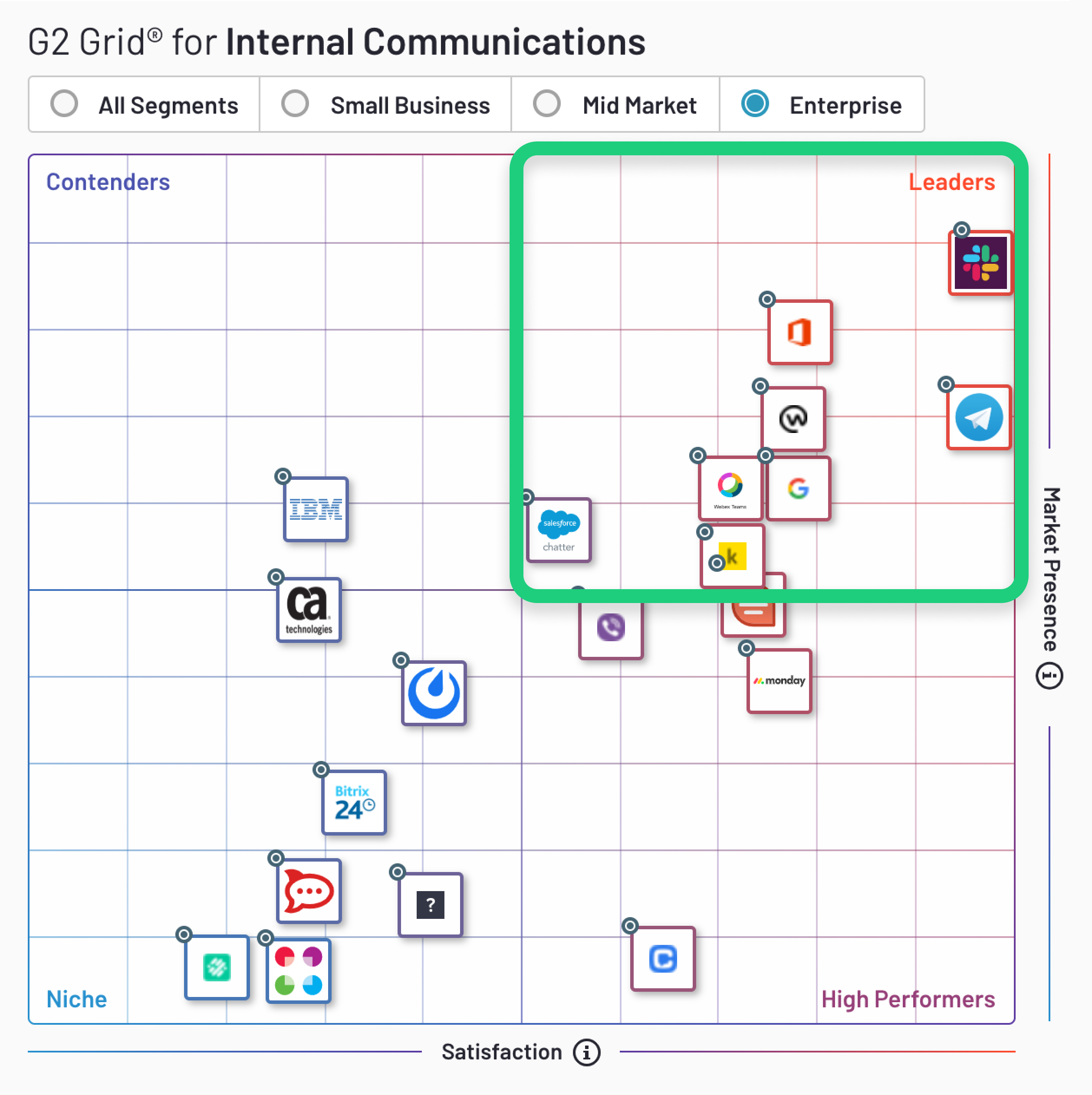
Enterprise internal communications apps like Slack, Workplace by Facebook, Google Hangouts, Microsoft Teams, and Telegram are now part of our workday. Chat is in collaboration tools like Asana, G Suite, and Dropbox. People are used to having multiple actions on a comment at their convenience.
The solution
We improved Comment Actions in Jostle by making the UI:
- Scalable. Frequently used actions can be “pinned” in front of the overflow menu. Less frequently used actions can be relegated to the overflow menu.
- Considerate of content. The menu got bigger so we popped it above the comment block. This way it doesn’t obscure the comment. Our solution still covers timestamps at narrow widths but we were okay with this trade-off. We figured, the timestamp may not be that important once you’ve decided to interact with the action menu.
- Easier to interact with. We increased the tappable area of actions from 17pt to 40pt, which increased affordance on mobile and desktop.
- Intentional. We separated performing an action from viewing reactions. This also also solved the issue of longer translations for labels breaking the layout. Translations in tooltips weren’t problematic because they appeared independently from the rest of the UI.
- Enjoyable to use. We improved spacing, color, and animated transitions to make interacting with the menu feel smooth—all in adherance with The Jostle Style Guide.